csepel onroad
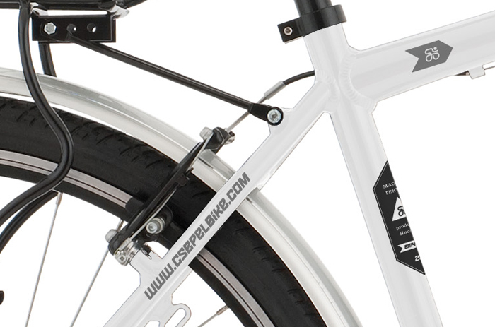
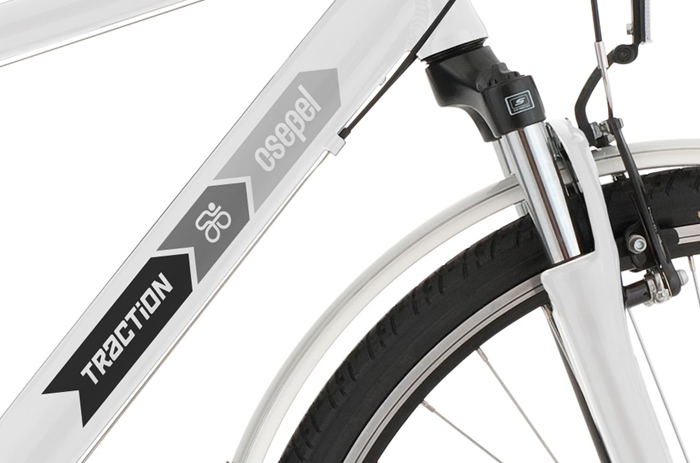
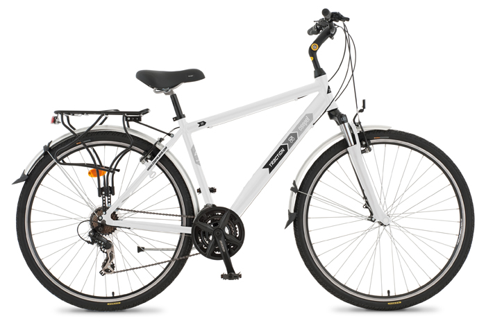
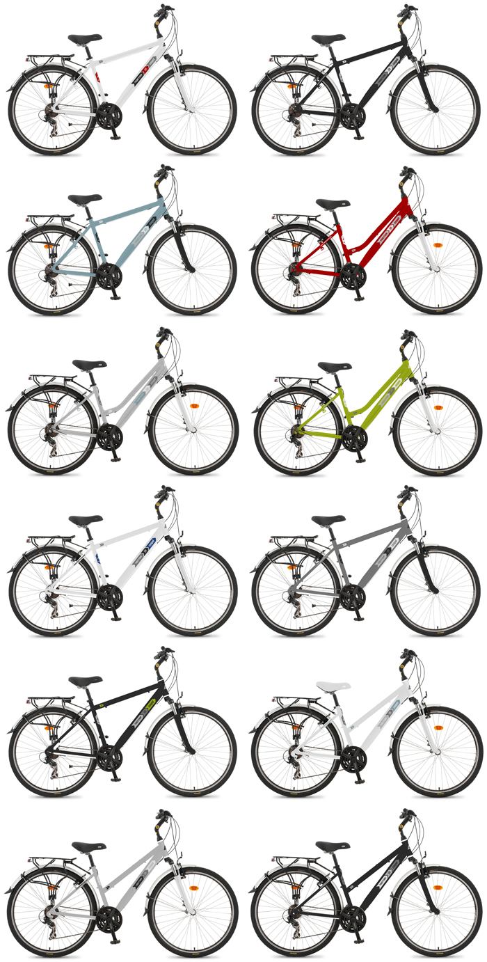
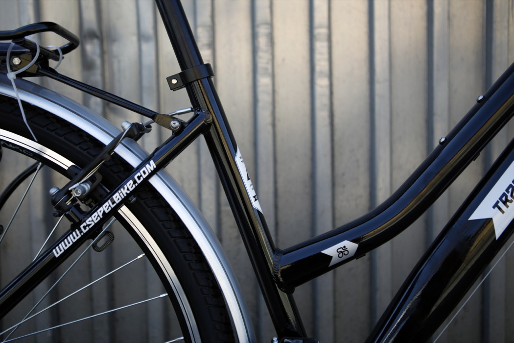
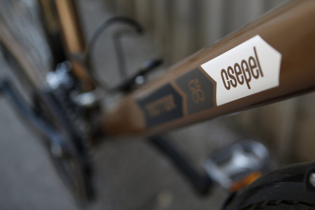
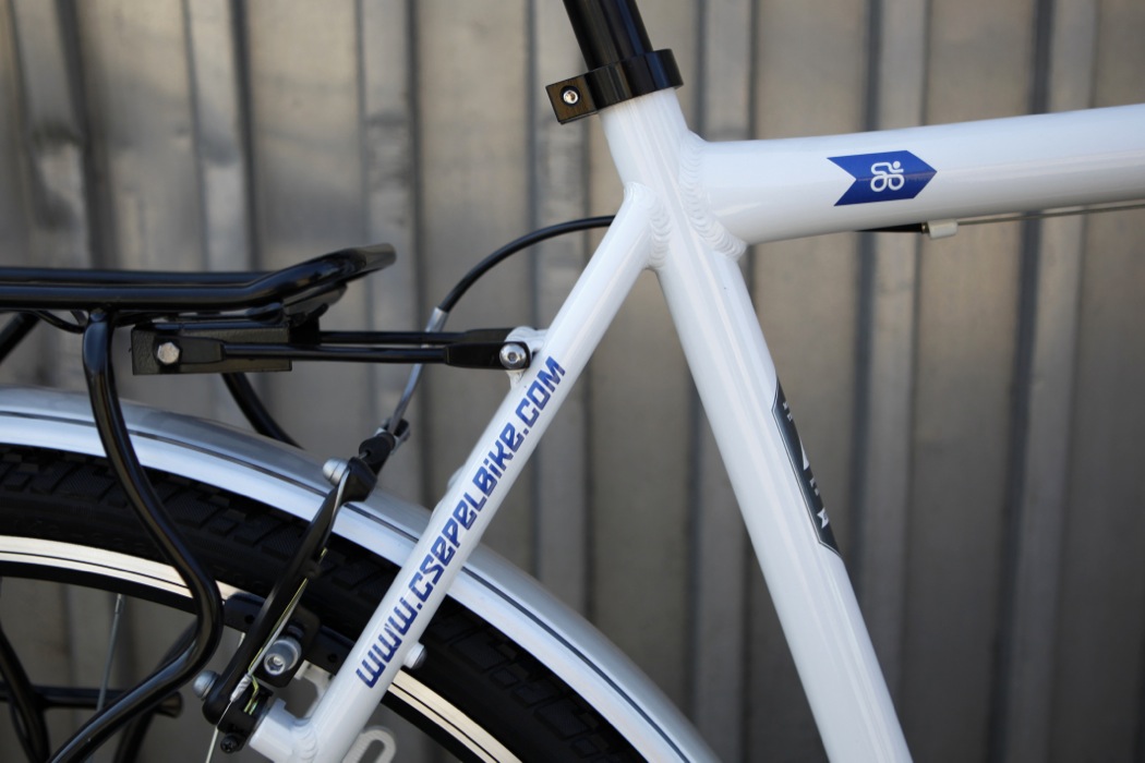
Csepel commissioned me with the redesign and visual unification of their existing trekking bikes - without any modifications to the physical objects, only through colouring and graphic design.
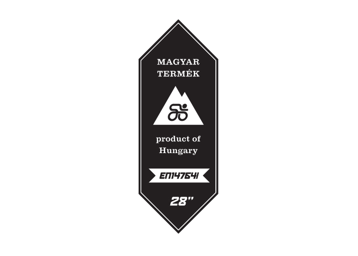
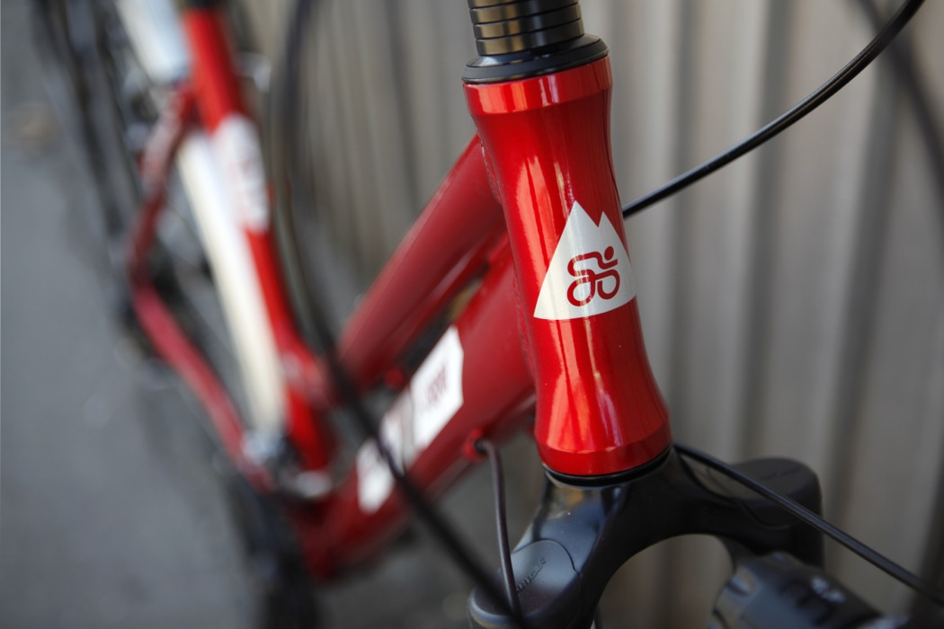
The simple, but recognisable designs extend the existing brand identity with symbols of outdoor activities, such as the silhouette of a mountain, and the well-known shape of forest path signs.
Fint more information at csepelbike.com.
• • •

